News
New health league table shows North-South divide

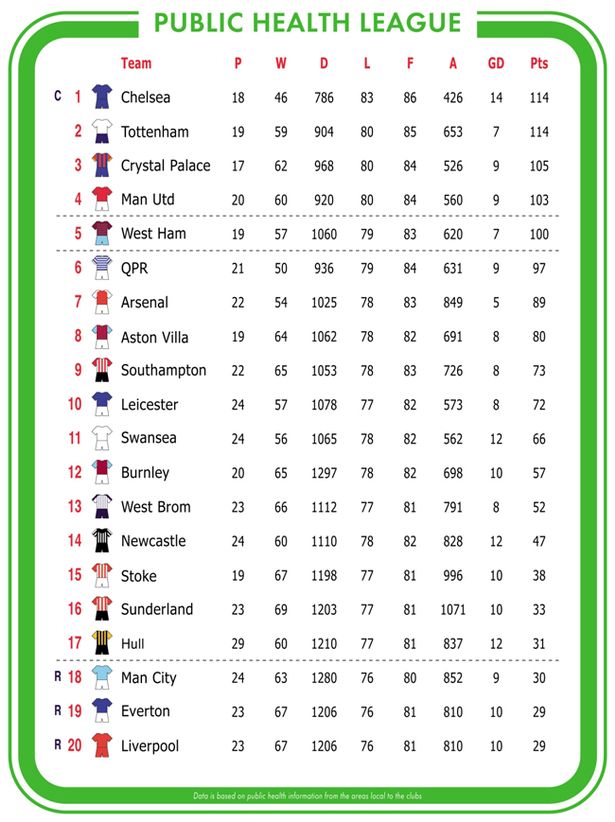
If the football Premier League table were based on life and death statistics, Chelsea would still be crowned champions but three of the biggest clubs would find themselves relegated – Manchester City, Everton and Liverpool.
This is according to a new analysis based on public health information led by Professor Clare Bambra (pictured), Associate Director of Fuse: the Centre for Translational Research in Public Health, which shows a clear North-South divide.
Approaching the final day of the Premier League, the public health league table ranks areas local to each of the clubs from best to worst using key health indicators such as life expectancy, obesity rates, percentage of smokers and alcohol-related hospital admissions.
The Public Health League Table (PHLT) throws up some unusual league places – at least in football terms – but also clearly demonstrates the extent of the North-South health divide in England. The top half of the table is largely dominated by Southern clubs and the relegated trio are all from the North West.
In the North East Newcastle United find themselves in a better position to where they currently are in the Premier League, finishing 14th and 17 points clear of the relegation zone. Rivals Sunderland fall just short of their neighbours, finishing 16th in the unique table based on health statistics by Durham academics.

Based on the state of their public health, joining Chelsea in the UEFA Champions League would be Crystal Palace, Manchester United and Tottenham Hotspur.
The PHLT shows a big contrast in life expectancy between champions Chelsea and the relegated Manchester City with men and women expected to live seven and six years longer respectively in the affluent London suburb compared to the area around City’s Etihad Stadium.
In addition to the clear North-South gap, the analysis also indicates health inequalities within towns and cities, as demonstrated by Manchester United faring much better based on data from Trafford Council than their ‘noisy neighbours’, Manchester City with data from Manchester City Council.
Men and women on the red side of Greater Manchester are expected to live four years longer than those on the blue side – only a couple of miles down the road. This is likely linked to the stark differences in economic deprivation between the two areas of the city, according to the Durham academics. Child poverty rates are as high as 34 per cent in the area around Manchester City’s ground compared with 14 per cent for Trafford.
These inequalities can also be found in the affluent areas with, for example, a 14 year gap in male life expectancy between the most and least deprived areas of Chelsea.
Professor Clare Bambra, lead of the Health Inequalities research programme in Fuse, said: “The North-South divide and the huge health inequalities that exist even within local areas are a serious public health concern.
“It is totally unacceptable that we still have these stark differences between different parts of our country.
“This public health league table is just another way to show these divisions but it is crucial that the new UK Government along with local authorities, the voluntary sector and the NHS tackles these ‘life and death’ inequalities.
“As the recent Due North report has shown, important steps to prevent the situation from getting any worse include a decent living wage, improving the quality and affordability of housing, providing high quality early years education and childcare, devolution of power to local communities, and promoting good sustainable employment.
“The £12 billion cuts to the welfare budget that the new government has planned will only make matters worse.”
The PHLT ranks the areas local to each of the 2014-15 Premier League football clubs from best to worst using the following key health indicators:
- P (Played) Percentage of smokers
- W (Won) Weight – percentage of obesity and overweight
- D (Drawn) Deaths – all cause mortality rates per 100,000 people
- L (Lost) Life expectancy for males in years • F (For) Female life expectancy in years
- A (Against) Alcohol-related hospital admissions per 100,000 people
- GD (Goal Difference) Gap or Difference in life expectancy for men between the most and least deprived areas of the local authority in years
- Pts (Points)* Points representing the sum of ranks for each health indicator
The data was taken from Public Health England Outcomes Framework Data, the Office for National Statistics and the Public Health Observatory Wales used under the open government licence. Premier League clubs were geo-referenced to the local authority with which they are most associated**.
* The final league points represent the sum of ranks for each outcome. For example, Chelsea’s score of 114 points comes from ranking 18th for Played, 19th for Won, Drawn, Lost, For and Against, and 1st for Goal Difference, where 19 is the best score and 1 the worst.
**Although Stamford Bridge – the stadium of Chelsea FC is in the borough of Hammersmith and Fulham, the public health data is for the namesake Royal Borough of Kensington and Chelsea.
Ranks are 1-19 even though there are 20 teams because Liverpool and Everton have the same data with Anfield and Goodison Park in the same local authority.
Relevant sources
Copeland, A., Kasim, A. & Bambra, C. (2015). Grim up North or Northern Grit? Recessions and the English spatial health divide (1991-2010). Journal of Public Health 37(1): 34-39.
Bambra, C, Barr, B & Milne, E (2014). North and South addressing the English health divide. Journal of Public Health 36(2): 183-186.
Cairns-Nagi, J.M. & Bambra, C. (2013). Defying the odds: A mixed-methods study of health resilience in deprived areas of England. Social Science & Medicine 91: 229-237.
Last modified: Tue, 19 May 2015 16:54:14 BST
